Fundamentals of Web Typography on Skillshare
I love typography, so I made a Skillshare class to help you learn all about the fundamentals of using type on the web.
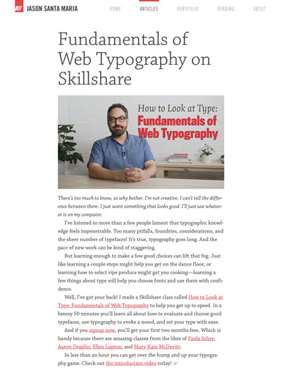
I love typography, so I made a Skillshare class to help you learn all about the fundamentals of using type on the web.
I Love Typography’s John Boardley with what I very much hope is The Last Word on Helvetica.
Dave Addey is at it again with another well documented and thoroughly enjoyable piece on the typography from the film Alien.
Hot damn! Unimark’s 1970 NYC Transit Authority Graphics Standards Manual is being reissued as a full-size book through an exclusive license from the MTA.
Tim Ahrens and Shoko Mugikura of Just Another Foundry have released an updated and expanded edition of Size-specific adjustments to type designs.
More articles are focusing on slowing down to not only convey their story, but to set and maintain a mood for the reader.
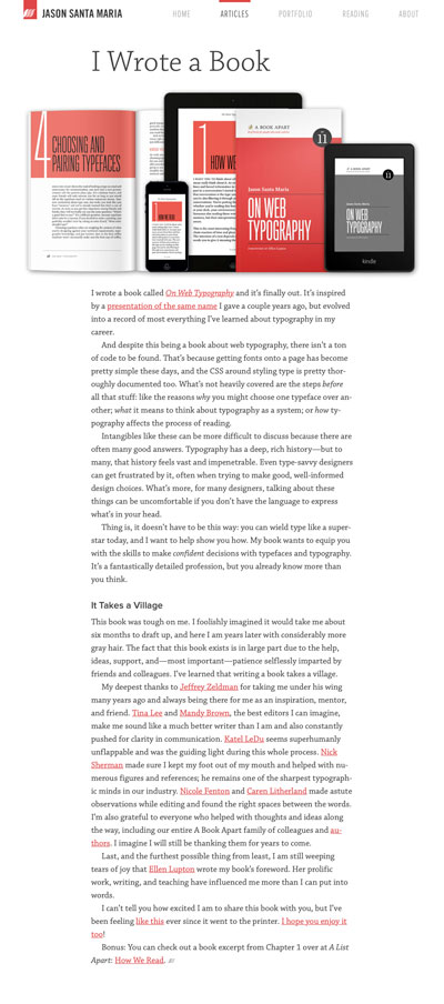
My book On Web Typography is out! *deep breath*
I’ve been reading comic books off and on since I was little. There was a time when I thought I’d like to pursue a career in drawing comics.
Today is National Punctuation Day (it’s totally a thing). To celebrate, I made a single-serving site to spread awareness of a horrible vestige in today’s typography: dumb quotes.
It’s with a heavy heart I write that today is my last day at Typekit.
A response to a Branch discussion about the usefulness of baseline grids on the web.
Look ma, I’m on PBS! Or at least the PBS website.
When I read this Designer Spotlight on type designer Frederic Goudy it made me remember again just how much I like him.
Symbolsets are semantic symbol fonts that replace words with icons via OpenType ligature support.
One of the best annual wrap-ups returns after a hiatus in 2009-10, Our Favorite Typefaces, from Typographica. Welcome back!
These upcoming Kafka covers by Peter Mendelsund are really lovely. These beautiful stark shapes and colors make them unexpected, but also totally on the mark.
A lovely gallery of Chevy speedometer designs over the years.
Just in case you were under the impression that type design or typography are easy.
We just launched something over at Typekit that we’ve been working on for some time, a brand new interface for browsing our type library.
One Minnesota Lake. One Logo. Every day.
Stephen Doyle’s beautiful type illusions from this past weekend’s New York Times Magazine.
Wood Type Revival seeks to acquire and release ten fonts of rare historic wood type representing faces that are not available in the world of digital typography.
Beautiful lettering from old fire insurance maps, courtesy of Christian Annyas. Totally not boring, I promise.
In episode 2 of the PBS documentary series Off Book they take a look at the importance of typography.
Check out some of this gorgeous work from Toronto illustrator, Jacqui Oakley.
There’s strong evidence that Times New Roman wasn’t designed by Stanley Morison, but by William Starling Burgess, a wooden boat designer from Boston.
About Face, a new article series I’m writing over at the Typekit Blog where we’ll look at the details behind a typeface and try to crack what makes it special.

Jason Santa Maria is a graphic designer living and working in sunny Philadelphia, PA. More


 Visual Grammar