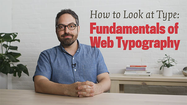
Fundamentals of Web Typography on Skillshare
There’s too much to know, so why bother. I’m not creative. I can’t tell the difference between them. I just want something that looks good. I’ll just use whatever is on my computer.
I’ve listened to more than a few people lament that typographic knowledge feels impenetrable. Too many pitfalls, foundries, considerations, and the sheer number of typefaces! It’s true, typography goes long. And the pace of new work can be kind of staggering.
But learning enough to make a few good choices can lift that fog. Just like learning a couple steps might help you get on the dance floor, or learning how to select ripe produce might get you cooking—learning a few things about type will help you choose fonts and use them with confidence.
Well, I’ve got your back! I made a Skillshare class called How to Look at Type: Fundamentals of Web Typography to help you get up to speed. In a breezy 50 minutes you’ll learn all about how to evaluate and choose good typefaces, use typography to evoke a mood, and set your type with ease.
And if you signup now, you’ll get your first two months free. Which is handy because there are amazing classes from the likes of Paula Scher, Aaron Draplin, Ellen Lupton, and Mary Kate McDevitt.
In less than an hour you can get over the hump and up your typography game. Check out the introduction video today!


 What is a Designer: Things, Places, Messages