Size-specific Adjustments to Type Designs

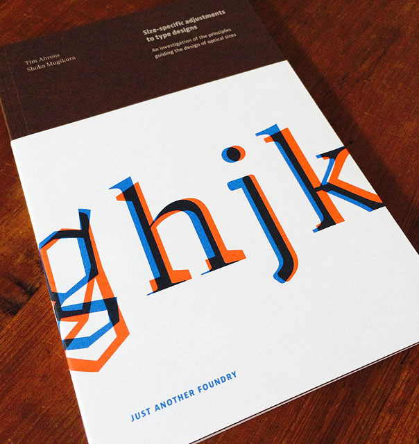
Tim Ahrens and Shoko Mugikura of Just Another Foundry have released an updated and expanded edition of Size-specific Adjustments to Type Designs:
The original version of this paper was written as part of Tim Ahrens’ MA in Typeface Design at the University of Reading in 2007. Tim first became engaged in the issue of optical sizes while he worked on the digitization and redesign of the Leipziger Antiqua (published as JAF Lapture in 2004). Through the project, he realised that although size-specific adjustments were commonly practiced for 500 years of metal type printing, not much documentation was available on the subject. This lead him to research and write about it himself, in the hope that the outcome would become a useful source for practitioners who wish to create fonts with size specific styles. The book looks into type history and perception psychology, and analyses designs by old masters as well as numerous contemporary designers.
I’m particularly interested in more widespread availablity and use of optical sizes for design on screen, where type is subjected to probably the widest variety of unknown, and sometimes harsh, conditions today.
“Optical sizes” are size-specific adjustments to type designs. They were practiced for 500 years of metal type printing. Since punches had to be cut separately for each type size, adjusting them accordingly did not involve any additional effort and the optical compensations were built into the fonts. Characters intended for use in small sizes typically show an increased width and x-height, reduced stroke contrast and looser spacing.
While this book is aimed more towards type designers, the material fills in a lot of the gaps in practice for typographers quite nicely too.
From the metal type era, hardly any documentation on the subject is available since punchcutting, like other crafts, was not discussed much in writing. The skills and insights were passed on from one master to the next by demonstration. Even today the design process of optically sized typefaces has rarely been recorded or analysed. This lack of resource lead Tim Ahrens to research and write about it himself in 2007, in the hope that the outcome would become a useful source for practitioners who wish to create fonts with size specific styles.
This is an insightful read behind the tools designers make (and use) everyday, and not to be missed. Grab a copy of Size-specific Adjustments to Type Designs today.


 The Art of Looking Sideways
