Five & Ten
This year marks my site's tenth birthday online, so I'm celebrating with a new design edition. This is number five!
I noticed something with my last site a little while ago. The custom designed articles I was posting (and that I loved to post) were keeping me from writing more regularly. It had nothing to do with the time involved to design those article, I usually kept things simple and got to be pretty fast at it, but more the presentation that bugged me. In order to post something, I felt it couldn't be short or just a quip on a topic, it had to be substantial. I fell into a design trap I unknowingly set for myself.
I decided to revise my thinking. I'd keep the theme of custom designs in my articles going, but set things up so that posts on any length or scope could live together in the same stream of content. What's more, I decided to not let the design of my site become a barrier to writing here. The most important thing this site does for me is give me a creative outlet to play and write. Anything that gets in the way of that needs to get the boot.
What you see here in the fruit of that labor. With the last design I set out with the goal of experimenting in art direction online, and this new design hopes to carry that baton a bit longer. If you liked the last site, little will change for you. I'll still be exploring design on a per-article basis, but now there will a bit more regular content to get at too. If you never liked the last design... well, you're probably wondering what the hell you're doing here now.
What's new?
One of the biggest features this new design touts is less. Less cruft, less in the way. You can see an example of what the homepage may look like below (just using some dummy content). Larger features get woven together with short and medium-sized posts in one stream. I corrected some of the design decisions from the last version, most notable on this here article page, so that I have a bit more flexibility to customize things.
The archives will still use screenshots of the custom articles, but paired with text for the shorter posts. On pages like the archive where it's primarily a visual browsing experience, I decided to let the content fill the space rather that be constrained by the column width of the rest of the site. I think it works nicely. Though, I'm still not entirely sold on keeping the jQuery Masonry around.
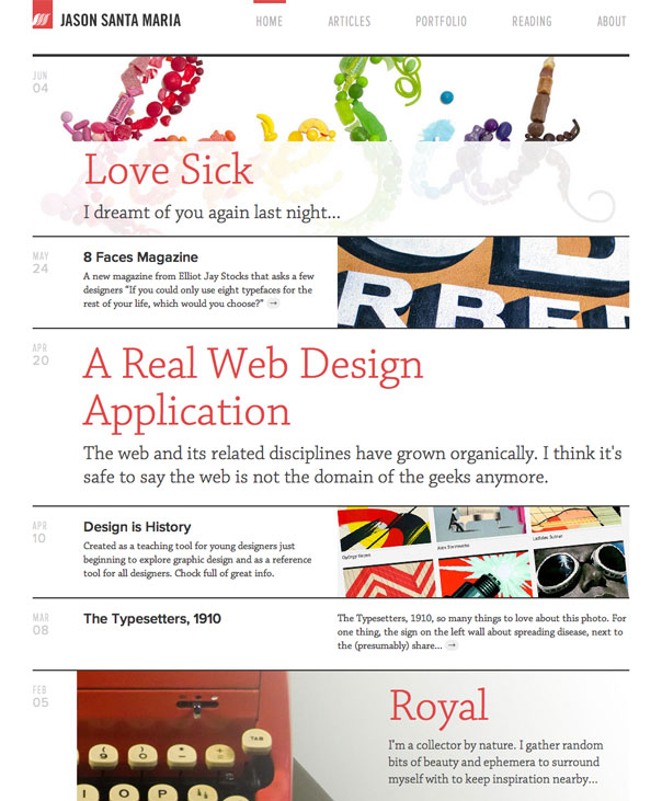
An early mockup of what the homepage might look like. View the full size version over at Flickr.
I've finally gotten around to making heavier use of webfonts here too. I'm using the lovely slab hybrid Chaparral by Carol Twombly for most of the text, along with small sprinklings of Mark Simonson's Proxima Nova (both normal and extra condensed) and Tim Ahrens' FacitWeb. All fonts are served up by Typekit. You can get more info on those fonts and Typekit by checking out that colophon link down in the footer.
My Daily Photo section has been retired, and I'll be posting more regularly over at my Flickr account. And good golly, a centered layout! I haven't done one of these since version 2.
Lastly, all the old RSS feeds should automatically be updated to the new one. You can also subscribe directly to the new RSS feed right now.
Where are the comments?
Comments are gone! For better or worse, I think the conversations that used to happen on everyone's blog have moved to places like Twitter and Facebook. And that's OK, but it made comments here less a place for discourse and more a place to just say "yay" or "meh". They may come back from time to time on an article, but they've been retired overall.
In progress
If you click around a bit, you'll see some things are still in progress. The portfolio will be moved over here soon enough, until then you can check it out on the old site. I'll need to revisit the design of the tags navigation on the archive page very soon. I took a stab at making an adaptive version for small screens, and it's working pretty well, but there are still some tricky bits I'm working to make better.
On the whole, some stuff may be a little wonky today, but I'm squashing bugs as I find them. Please bear with me. If you notice anything majorly amiss, please feel free to drop me a line from the About page.
No, thank you
I wear many hats on any given day, so in order to get anything done for myself like this site, I lean on my friends a lot and take advantage of their big brains. This site wouldn't have been possible without the advice and assistance of these fine folks: Mandy Brown, Frank Chimero, Kevin Cornell, Liz Danzico, Jeremy Keith, Dan Mall, Ethan Marcotte, Sean McBride, Dave Rupert, Trent Walton, Matt Weinberg, Rob Weychert, Greg Aker and Brandon M. Sweet from Happy Cog Hosting, and of course, all of my wonderful Studiomates. Thanks for your patience in answering my many inane questions at all hours of the day.
In closing
You can still check out the last version of this site here. I'm big on archiving past versions, as embarrassing as some may be. You can find links to them all on the About page. Oh, and I'm working on a new title for A Book Apart that will come out next year, On Web Typography. Until then, click around a bit and enjoy!


 The Brand Gap