Beautiful Bitmaps
The wonderful folks over at UPPERCASE Magazine invited me to participate in a fun typographic project called “Beautiful Bitmaps” for their latest issue:
For issue 15, we invited 26 typographers, designers and illustrators to make beautiful bitmaps by taking this vestigial part of digital type—the bitmap—and making it into something to be newly appreciated.
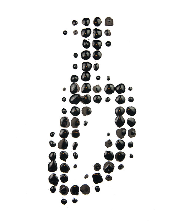
Each person was assigned a letter. I was given the letter “b” to reinterpret, and immediately thought of Mr. John Baskerville. Baskerville is responsible for many influential letterforms, but he also pioneered new techniques in printing, paper, and ink-making. He developed inks that were darker and richer than those in use by any of his contemporaries in the mid-18th century. And with that ink, Baskerville’s type came alive.
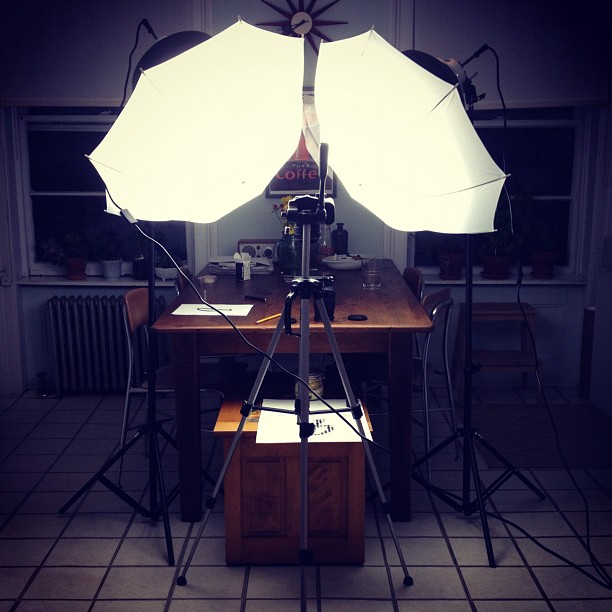
The idea came together pretty quickly: big ink drops on paper and a quick photo before they all dried. Here’s a photo from the shoot I set up in my kitchen:
And the final result of my letter:
All of the results are really fun, and are available to buy as prints (from very small to very large). A portion of proceeds from Beautiful Bitmaps will go to creating an UPPERCASE scholarship fund to assist a reader in pursuing education in design, illustration, typography or craft. I particulalry love Grant Hutchinson’s and Erik Marinovich’s letters.
If you happen to be around Calgary, all of the pieces will be on exhibition at UPPERCASE starting on October 4.


 Envisioning Information